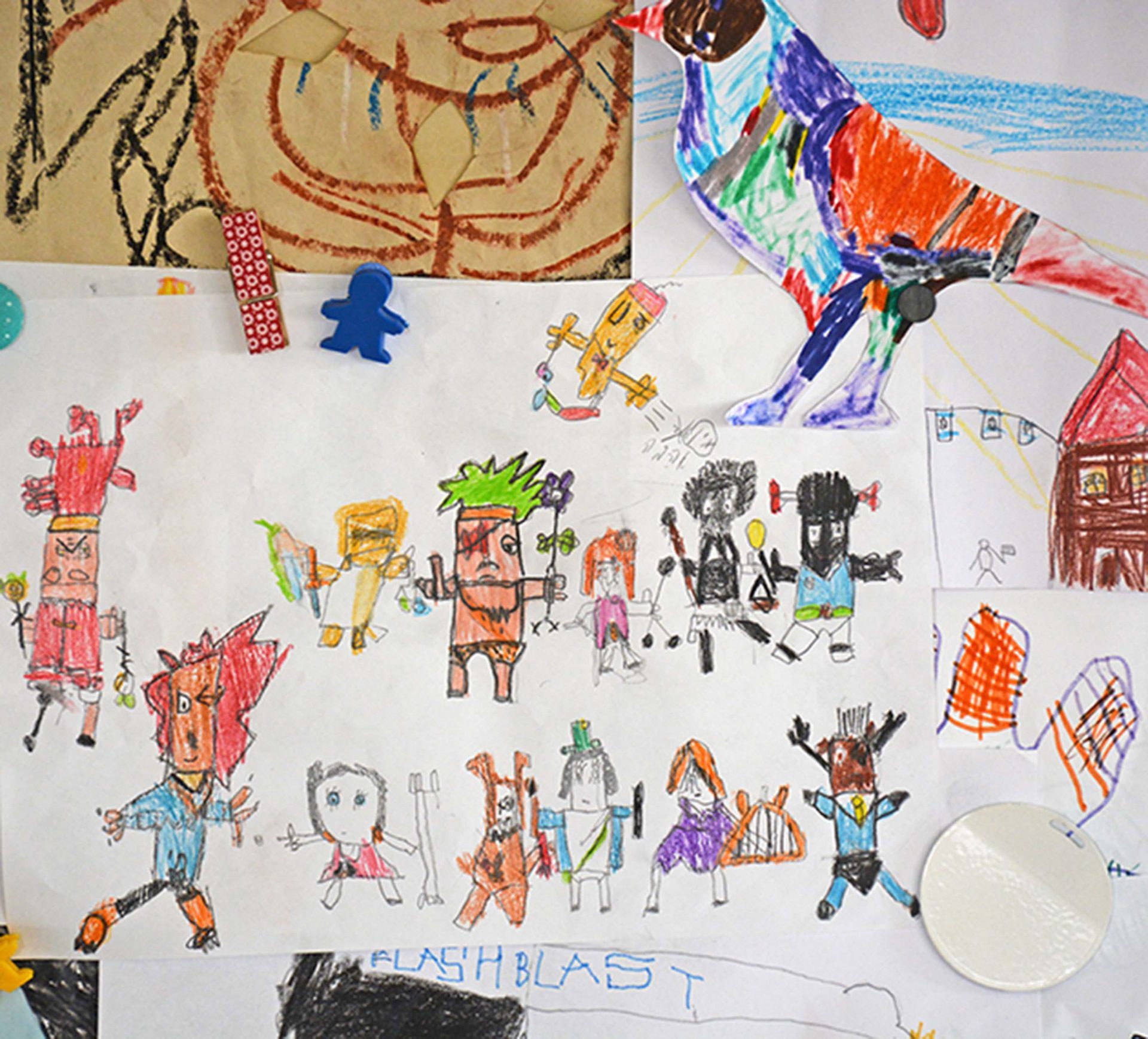
Have you also experienced that feeling while looking at a kid painting? what an incredible composition, how beautifully coloured. One of the unforgettable painting exhibitions I saw, was that of a wall full of children paintings at the Collete’s art gallery in Paris, few years ago. In this picture below you see what Minion2 painted when we came back from a street art tour E gave us last weekend.
When I was a student in Shenkar college, one of my teachers told me, we all born with this ability to create the perfect coloured compositions but we lose it as we grow old and develop our self conscious. Isn’t that interesting? How hard could it be to create a colour combination? if a child can do it, you can too. Well creating a colour combo isn’t complicated, but creating a great colour combo is not that easy.
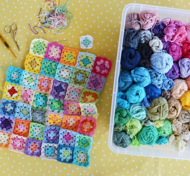
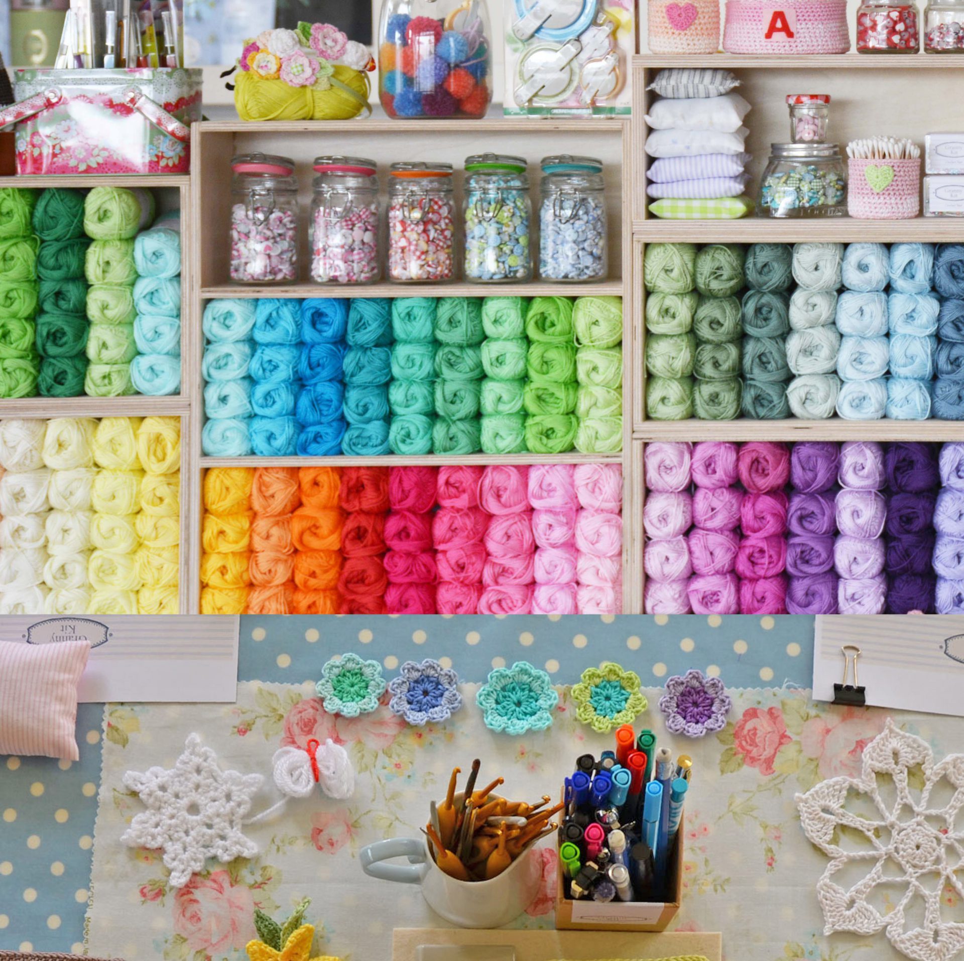
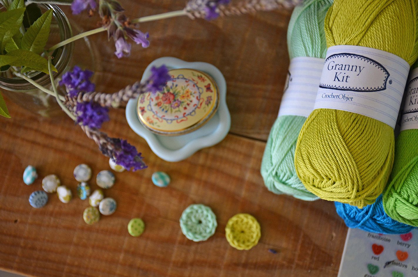
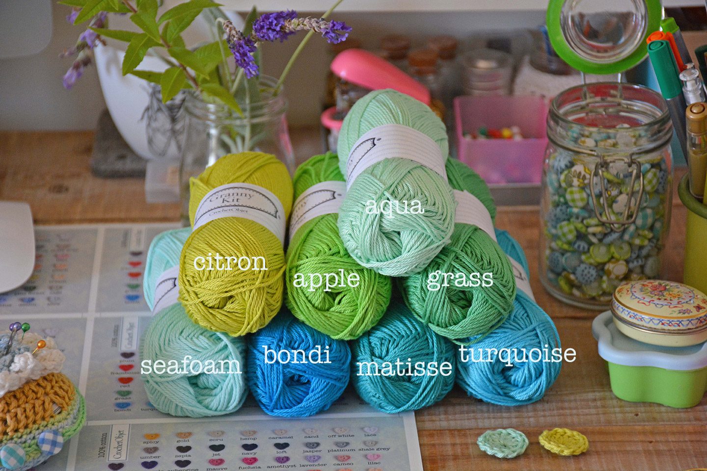
As I mentioned at my previous post, I’ve added 2 new colours to my Granny Kit cotton collection recently. It’s been a while that I’m thinking to add new colours to this huge cotton collection. Thinking ahead of the coming soon summer, I was looking for fresh and vibrant colour or two to fit within the entire collection but on the other hand to bring their own power to any project you are thinking of. It ended up with Citron and Aqua but it was a long journey to come up with a decision of what colour should it be and than after choosing the colour it was quite a process to be able to point to the right lightness or darkness to put in.
At first I thought each one of them will work perfectly with a different group of colours and will expand it’s group varieties, while at the end, when I received the final lab samples I was so happy to see they sit nicely within the same group of colours, as well as a stand alone colour.
See how the Citron works so well next to a warm green like the Apple, the Aqua works perfectly next to Grass (a cold green, more blueish). At the same way you can see how the Seafoam makes the blue colour group so reach and pop it up and both groups of greens and blues work so well together. I think it’s that mixture of worm and cold colours together and the richness of shades within the same colour group that makes it work great together.
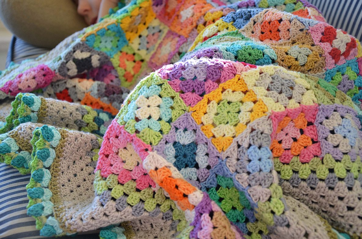
And lastly, creating a great colour combo is something you can learn how to do but it takes trials and time, so don’t worry if you still struggle with it. There is always more room for improvement. Just remember always start fresh and try to think like a child. Try this with your next project and see how dose it work for you. leave me a comment, let me know what you think.
P.S. Citron and Aqua are now at the shop and you can add them to your colour list.
P.S.S. If you want more help with colouring your project click here.

7 comments on Notes from my latest colouring thoughts
bacchuspr
Oui, il est logiquement correct
bacchuspr
Elizabeth
Its delicious,just want to eat everything my eyes caress.
Beautiful and totally inspiring.
Mo Malron (author)
Thank you E, your note makes me happy
Natalia
Me encanta todo lo que veo pero necesitaria la traduccion para entender todo lo que dice.
Felicitaciones!
Mo Malron (author)
Gracias Natalia!
Wwe Immortals Hack
Its like you learn my mind!
Mo Malron (author)
XOX, thanks:)